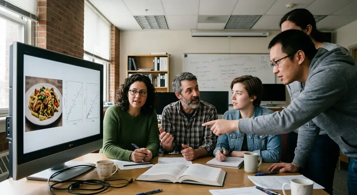
Editorial illustration for The Unappetizing Sameness of AI-Generated Menus
Why AI-Generated Restaurant Menus All Look Identical
The Unappetizing Sameness of AI-Generated Menus
A bagel sandwich shouldn't make you uneasy. But there it is, laminated on a coffee shop counter: a sesame bagel so symmetrical it looks machine-tooled, cream cheese pooling in a swirl too perfect for human hands. Nobody at the register can explain it. The sandwich just sits there, wrong in a way that's hard to name until you've seen three more menus doing the same thing.
Restaurants have started leaning on generative AI to fill out their menus with food photography stand-ins, cheaper and faster than hiring a photographer or illustrator. The results have a tell. Cheese stretches into bubbly, otherworldly ropes.
Shrimp curl in ways that suggest they've forgotten how tails work. Ice cream scoops arrive as flawless spheres nobody has ever scooped by hand.
The problem traces back to how these image models get trained, on a narrow slice of what counts as "pleasing" food photography, which flattens every dish into the same uncanny register. Alex Lisle, chief technology officer at Reality Defender, a startup built to detect AI-generated content, has a theory for why the results look the way they do.
“The optimization of the data sets is for pleasingness, or you know, not being offensive, and so there’s a way that turns into homogenization,” Lee Rainie, Director of the Imagining the Digital Future Center at Elon University, told TechCrunch. “What AI is known to do both in images and language is to shave off the edges.”
Why this matters
For anyone building with generative image models, this is a warning about the cost of defaults. The same diffusion checkpoints that make a founder's pitch deck or app icon look polished are trained on that same narrow "pleasing" aesthetic, the one producing bagels that look airbrushed rather than baked. Restaurants adopting AI menus assumed speed and cost savings would outweigh design nuance.
Instead they got a visual tell so consistent that diners spot it on sight and, per the sourcing here, push back hard enough to make news. That's a signal worth sitting with: sameness isn't a neutral side effect, it's a brand liability. If you're a developer shipping AI-generated visuals into any customer-facing product, menus, packaging, marketing, the lesson isn't "AI images look bad." It's that unexamined default outputs carry a detectable fingerprint, and customers increasingly recognize it as synthetic before they recognize what's wrong with it.
Founders treating image generation as a free design department should ask who's actually reviewing outputs against real reference photos, and whether "close enough" is close enough when trust is on the line.
Related Reading
 LLMs & Generative AI
 ChatGPT's 'Nerdy' tweak rewards goblin metaphors in answers, study finds
 LLMs & Generative AI
 Google to End Free Access to Gemini AI for Non-Subscribers
 LLMs & Generative AI
 AI Engineers Face Rising Costs, Need New Strategies for Efficiency
 From Archives
 Major AI chatbots ChatGPT, Grok, and Claude experience simultaneous outage
 From Archives
 OpenAI’s GPT-6 Astra Hits 72.6% OSWorld Benchmark, Cuts Task Time
Common Questions Answered
Why do AI-generated food images on restaurant menus look unnaturally perfect and uniform?
According to Lee Rainie, Director of the Imagining the Digital Future Center at Elon University, AI image optimization is designed for 'pleasingness' and avoiding offense, which leads to homogenization. This process causes AI to 'shave off the edges,' resulting in overly symmetrical and airbrushed food photography that lacks the natural imperfections of real cooking and plating.
What cost-benefit tradeoff are restaurants making by using generative AI for menu photography?
Restaurants are adopting AI-generated menus because they are cheaper and faster to produce than traditional food photography. However, they are sacrificing design nuance and visual authenticity, as the AI-generated images produce such a consistent and recognizable aesthetic that diners can immediately spot them as artificial rather than appetizing.
How does the training data for diffusion checkpoints affect the visual output of AI-generated images?
Diffusion checkpoints used in generative image models are trained on a narrow 'pleasing' aesthetic that prioritizes polish and consistency over authenticity. This same training data that makes pitch decks and app icons look polished is responsible for producing unrealistic food images, such as sesame bagels that appear machine-tooled rather than naturally baked.
What warning does this AI menu trend present for developers building with generative image models?
The prevalence of unappetizing AI-generated menus serves as a cautionary tale about the cost of relying on default optimization parameters in generative models. Developers should be aware that the same narrow aesthetic optimization that produces polished results can also lead to homogenization and create a recognizable visual 'tell' that undermines the intended purpose of the generated content.
Further Reading
- Bizarre AI food images jump from online to IRL menus - NBC News
- Why restaurants are facing backlash for fake food pictures - CNN
- The AI-slop menu is disgusting and, sadly, makes perfect sense - Business Insider
- AI Restaurant Menu Innovation With GPTs - US Foods
- The influence of AI-generated versus real food images on perceived value and negative WOM - University of Zaragoza Repository